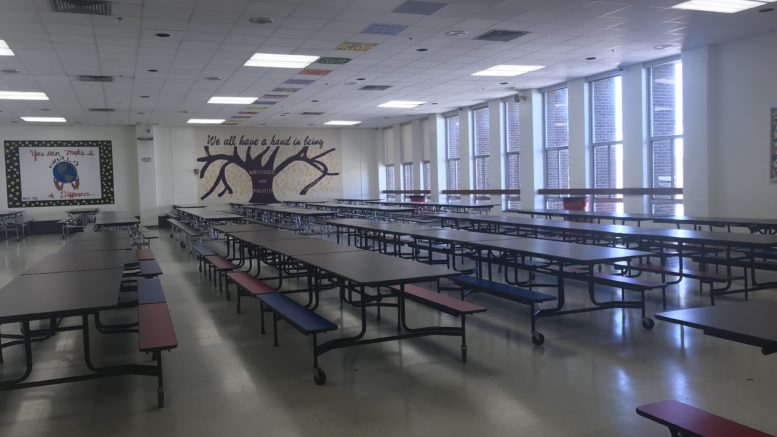
Both the Raynor and Finch cafeterias are used by hundreds of students each day. The cafe is a place to eat, hangout with friends, or do homework throughout lunch.
The cafeterias have had the same arrangement for quite some time. There has been very little change to the two large rooms as students have come and gone.
Change is good, this generation loves new “cutting edge” designs and ways of life. Students may react positively to a rearrangement of the cafeteria. Changing the tables into a new design and adding more of our school colors could really enhance the cafeterias. Both the cafeterias have been rather dull and arranged horizontally for too long. Finding a new design and adding more decorations would really give the cafeterias a better vibe that would make being in there more enjoyable. It could also be fun for students to come up with their own designs for the cafeteria. Students who foresee a future career in architecture/design could really get creative with this kind of project.
“There should be a change because vibrant colors and a better design would brighten the mood instead of everything just being dull,” said junior Tais Alicea. While most students do not put a second thought into the cafeterias, some students think a change would be welcomed. “A new design would be great, as it’s kind of dark and boring the way it is now,” said junior Reynold Rene.
Nonetheless, it is not on the top of people’s minds. The school could use the resources for supplies instead of re-designing the cafeteria. “I love change, but I feel like it’s also fine the way it is,” said senior Samantha John-Folks when discussing a potential renovation. Ultimately, re-designing the cafeterias is not a top priority. But, if it were to become one, it seems that many students would have an opinion.


